Make a Paper Menu’s Food Names Easy to Read
By Love Coma Cakes Editorial · Published February 1, 2022 · Updated February 1, 2022
Make a paper menu’s food names easy to read, checking lettering, contrast and corrections before adding a decorative border for a small home meal.
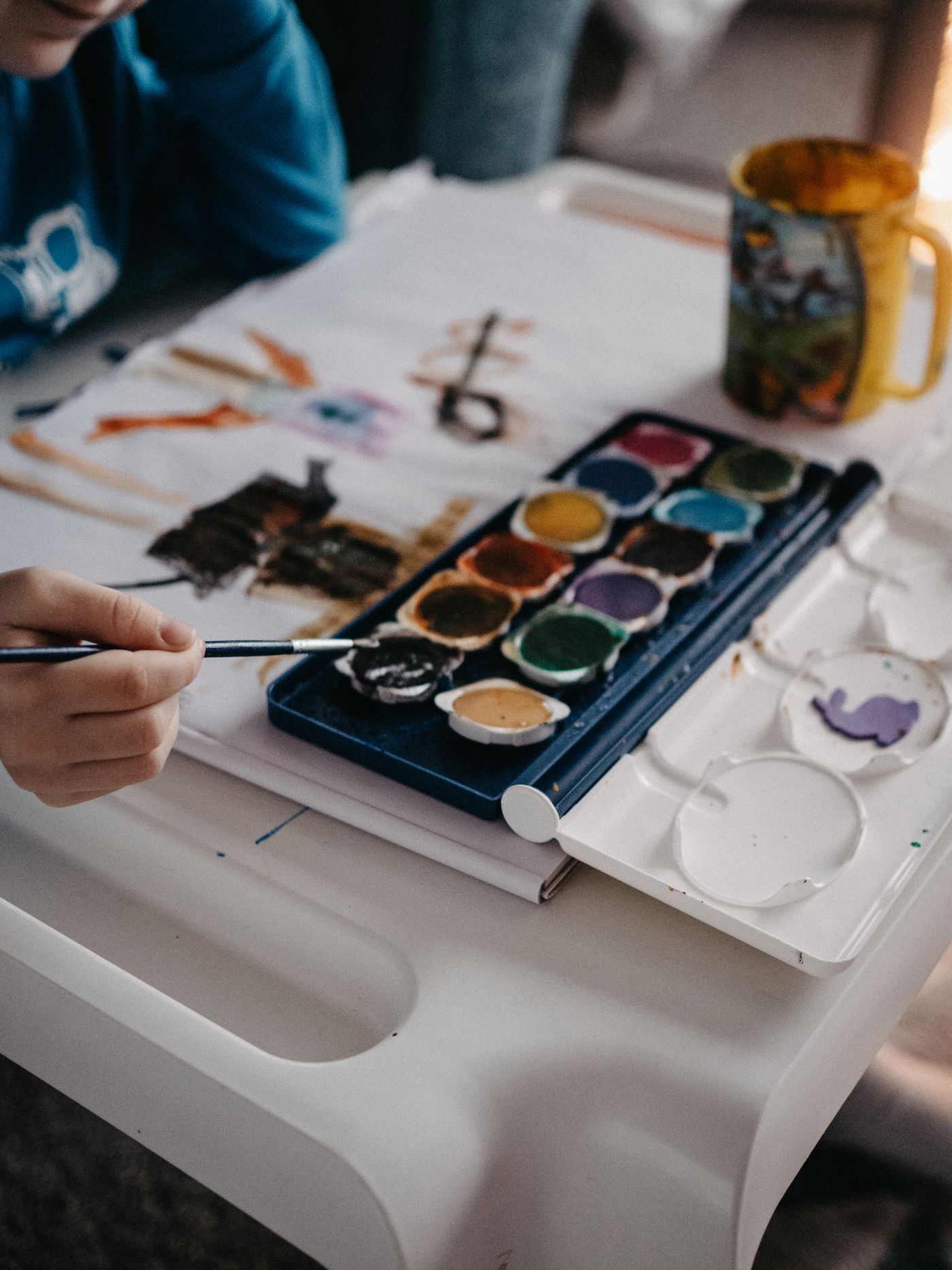
Illustrative photography. Images show editorial inspiration, rather than a product or recipe test.
A paper menu can help a small home meal when the food names remain easy to read. Decorative lettering and a colourful border should support that role rather than obscure it. Draft the words first, then add only the detail that leaves the meal information clear.
Decide what the menu needs to say
Use the actual planned food names, not a more elaborate description invented for the card. A simple dish does not need a restaurant-style title to belong at the table. Keep the number of lines connected to the menu actually being served.
Do not use the decorative card as the only way to communicate important ingredient information. Answer guests' food questions directly and accurately, using the relevant product and recipe details. A short handwritten title cannot establish every ingredient or suitability question.
Draft the words before the border
Write the full menu on spare paper to check spelling and line length. Leave enough space between dishes for each name to remain distinct. A long title may need two plain lines rather than smaller letters squeezed into a narrow gap.
Choose a clear lettering style you can repeat comfortably. Mixed capitals, loops and flourishes may look attractive close up while making an unfamiliar dish difficult to read. Keep the words more prominent than the decorative marks around them.
Compare contrast from the table
Use a suitable dark or otherwise clearly contrasting mark on the chosen paper, testing the materials on a spare piece first. A pale colour can disappear under the room's ordinary lighting. Check the card at the distance where guests will see it, not only while holding it near your face.
Place a draft in its intended suitable position beside the actual table objects. Make sure it does not become hidden behind a glass or interfere with a stable serving area. A larger card is not automatically more readable if it occupies a busy part of the table.
Leave room for a real change
Keep a plain replacement draft or a clear correction method available if the menu changes. Avoid crossing out so many words that the card becomes misleading. For a small meal, rewriting one simple card can be easier than preserving a complicated design.
Add a modest border after the text works. Keep decorative materials suitable for their position and separate from food contact. The drawing can be a pleasant household activity without requiring it to become part of the food itself.
After the meal, keep the card only if it has a meaningful personal role. A useful paper menu has done its job when it made the planned food understandable, with decoration leaving enough space for the words to remain the most readable part.
Related reading
Draft a Guest Menu Away From the Kitchen Before Checking Stock, A Simple Table for Everyday Guests.
This story belongs to our February 2022 editorial issue. Publication and update dates follow the journal’s monthly editorial calendar. Our guidance is based on editorial research and practical planning, not an undisclosed hands-on product test.